Saturday Painting Palooza Vol. 141
Welcome back.

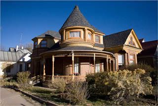
This week we will be continuing with the new painting that I started last week, the Victorian house in Las Vegas, New Mexico, seen in the photo directly below. As usual, I'll be using acrylics. This one is large for me, the canvas is 11x14.
When last seen, the painting appeared as it does in the photo seen directly below.
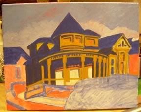
Since that time I have continued to work on the painting.
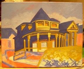
Each week I try to make changes that are readily visible. I hope that these are. I've actually spent considerable time working on the building facade. The turret now appears in the lighter yellow color of the photo. The porch posts below
have received considerable attention, now reshaped and with added detail. The heavy blue shadow of the porch and to the left is now actually composed of several blue hues. The windows and surrounding detail to the far right of the building have been reshaped and enhanced. They now more closely resemble the photo. Down in front the area that will become the shrubbery has been the lucky recipient of some excess paint but does not resemble in any way what it will eventually be.
The current state of the painting is seen in the photo directly below.
That's about it for now. I'll see you next week. As always, feel free to add photos of your own work in the comments section below.

This week we will be continuing with the new painting that I started last week, the Victorian house in Las Vegas, New Mexico, seen in the photo directly below. As usual, I'll be using acrylics. This one is large for me, the canvas is 11x14.

When last seen, the painting appeared as it does in the photo seen directly below.

Since that time I have continued to work on the painting.
Each week I try to make changes that are readily visible. I hope that these are. I've actually spent considerable time working on the building facade. The turret now appears in the lighter yellow color of the photo. The porch posts below
have received considerable attention, now reshaped and with added detail. The heavy blue shadow of the porch and to the left is now actually composed of several blue hues. The windows and surrounding detail to the far right of the building have been reshaped and enhanced. They now more closely resemble the photo. Down in front the area that will become the shrubbery has been the lucky recipient of some excess paint but does not resemble in any way what it will eventually be.
The current state of the painting is seen in the photo directly below.

That's about it for now. I'll see you next week. As always, feel free to add photos of your own work in the comments section below.


0 Comments:
Post a Comment
Subscribe to Post Comments [Atom]
<< Home